Apologies for all the dining room posts lately but well, this is basically consuming my every thought at the moment aside from client work and so I figured I’d share what we got up to this past weekend! As much as I’d love to show you beautiful pictures every single week, I think if you are planning a remodel and you are doing the work yourself, you have to be prepared for the work to drag on a bit and have lots of ‘un-pretty’ in between! I guess it’s really just about knocking each little thing off the list until the room is done and it’s just never fast enough for my liking ;) I’m gonna guess it’s the same for you!
Anyway, as I mentioned last week, we’d installed all the dado rails and architraves but the skirting board needed to be fit and everything needed to be filled (caulked for my American brethren). I had visions of completing all that on Saturday and spending Sunday painting the doors and skirting board but yeah, that vision so didn’t happen. It took Wayne a good portion of Saturday to just get the skirting boards nailed on and then he started the filling process which ended up going into Sunday as well. As I couldn’t paint until the fill is totally dry, there was no painting on Sunday. Booooo.
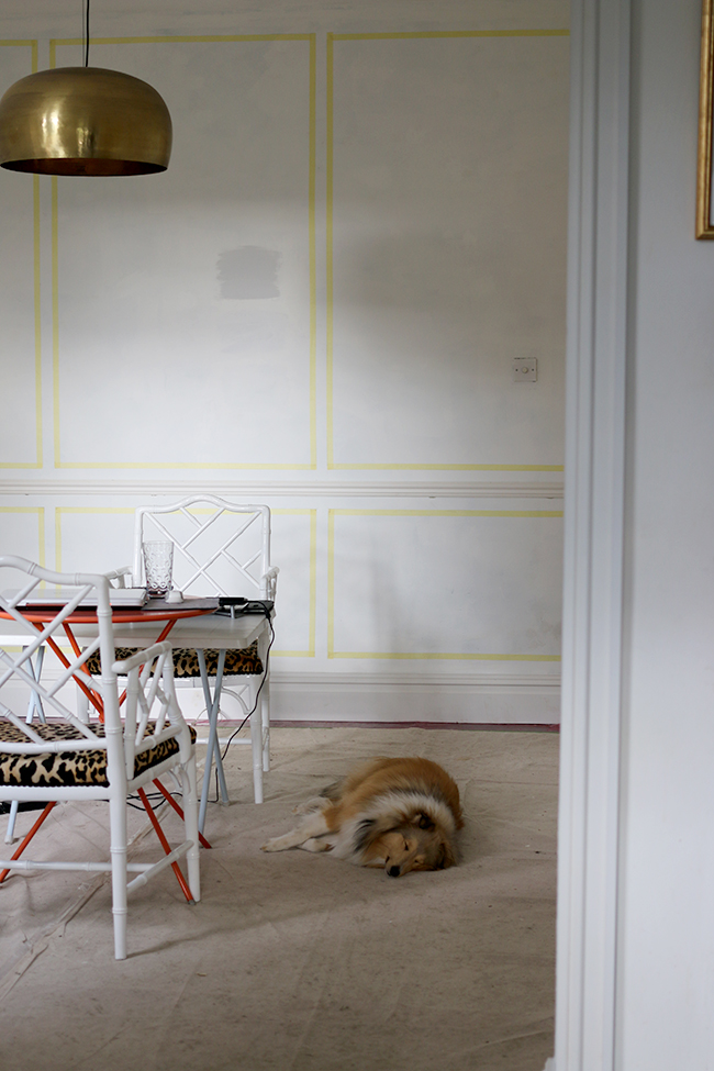
Instead, I decided to start mapping out where I wanted all the decorative panel mouldings to go and so while Wayne worked on the filling, I had my measuring tape, spirit level and about 4 different straight-edges as well as the laser level, pencil and masking tape to map out the whole room. From where we masked off, we could measure everything up and figure out how much of the paneling we’d need to order in. OH AND THERE WAS MATH INVOLVED. And of course, there are no straight walls in our house which made doing this even more… erm… interesting.
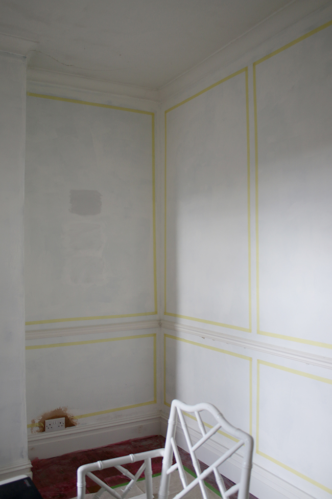
This took me HOURS. I was never particularly great with math – I’m a visual person really and thus the need to even do this at all to see what it will look like, but I soldiered through. I worked all day Saturday and Sunday to get this right but I’m pretty happy with it now and even just in masking tape, I really think it’s going to look rather grand! Me and my fancy pants dining room – eek!
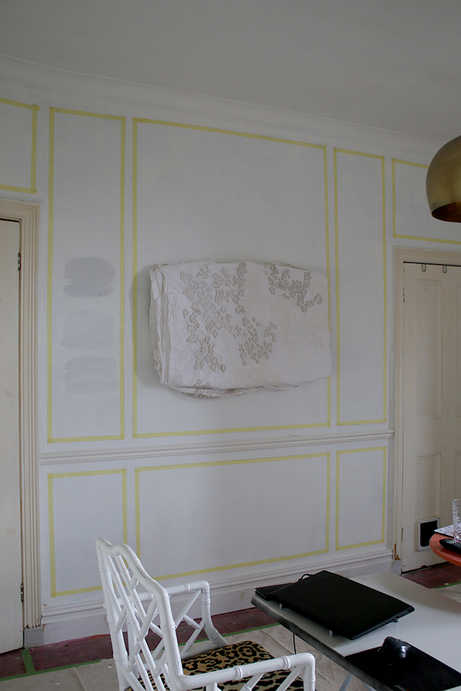
Excuse the old duvet slung over the TV in here! Ha! #keepinitreal Also, you can see where I painted over the paint swatches I was considering if you were wondering what those splotches on the wall were.
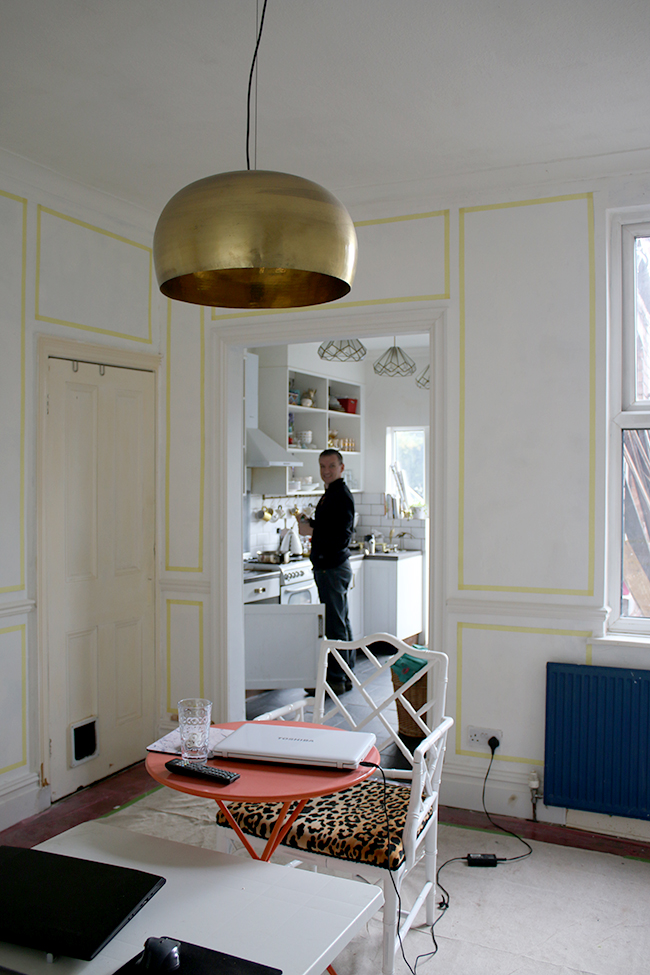
Our messy makeshift ‘dining area’. Notice that Wayne is always happiest when he’s cooking and there’s DIY happening. Is it any wonder why we’re together?
In other news, I finally decided on a paint colour – whoop!
First an interesting observation: I had a paint card for Farrow & Ball’s Cornforth White and already had some leftover paint of Dulux’s Dusted Moss 2 from the living room. When I painted a tester on my walls of the Dusted Moss, I realised that – at least in my dining room – it’s a DEAD RINGER for Cornforth White! So if you are looking for a cheaper alternative to F&B’s Cornforth White, well, Dulux Dusted Moss 2 is it. Crazy that those were initially the two colours I’d considered for the dining room and they ended up being nearly the same freaking shade.
Anyway, neither of those were the colour I chose. I also got samples of Farrow & Ball Blackened, Dimpse and their new colour Dropcloth. As soon as I opened the tin for Dropcloth, I knew it would read way too beige for what I wanted in here so dismissed that immediately. But Dimpse and Blackened were both rather lovely.
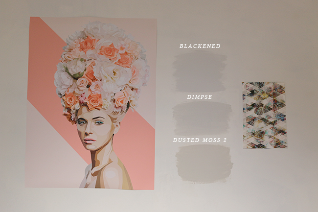
I blue-tacked my main art print and the wallpaper sample to compare against!
I will admit, as soon as I opened the Blackened tin, I knew I’d found my colour (I always seem to know when the paint colour is right nearly immediately so either I have a gift for choosing colour or I am VERY lucky – probably the latter) but of course, I wanted to get them all up on a few different walls in the room and compare.
The Dusted Moss read a bit too mushroom in the south-western light in my dining room. In my north-east facing living room, the colour looks cooler and softer but it went very muddy in the light and I knew it wasn’t quite what I wanted for in here. Dimpse was like a lighter version of this but still had quite a brown-y undertone.
Blackened, however, GLOWED. It was just such a beautiful shade – clean and clear with a bit of a red undertone without it overpowering or going too warm. I know it’s a bit hard to tell from that picture above but here’s a pretty good representation (at least on my screen!) of the colour. The one on F&B’s site didn’t really look the same as what it looked like on my own wall.
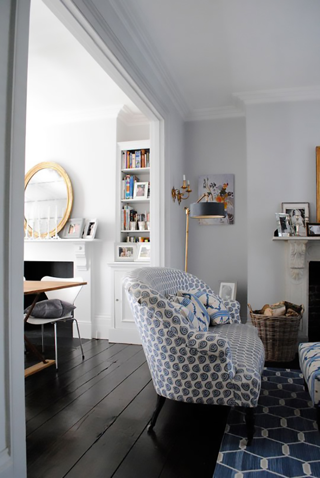
Blackened by Farrow and Ball – photo by Eleanor Busing for Apartment Therapy
I paid attention to each shade on the walls throughout the day and through various weather (it’s gone from sunny and bright to SNOWING to dark and miserable rain and back to full sun in the last week – welcome to England) and in every circumstance, I still loved Blackened. Happily, when I asked Wayne to choose his favourite (I’d not told him mine at that point), he also chose Blackened. So that’s decided then! Blackened it is.
Hopefully, if I have the time this week, I’m going to try to get the gloss painting done on the doors and skirting boards and install my pretty new brass handles! They are from M Marcus Heritage Brass collection and they are just stunning.

Hopefully I can share that with you soon so stay tuned. There’s so much more to come!
In the meantime, I realise the progress seems glacial but what do you think of the colour choice? The hardware? Where ultimately the moulding will end up? Are you as excited as I am to see this room finally taking shape? Okay, probably not but STILL. Can I have a fast forward button on this project please?


Aren’t the lighter/neutral colours ALWAYS the hardest to choose?! So glad you finally found the one. And congrats on all that panel masking. I bet your arms and shoulders were hurting by the close of play on Sunday. You’re over the hardest bits now chuck. Enjoy the next few weeks seeing it all come together!!xx
I was really afraid it would take me forever to find the perfect grey so happy it wasn’t TOO bad :D Thanks darling, I can’t wait to start painting! xx
The Blackened is gorgeous, just lovely with the artwork and paper.
I was also thinking Cornforth White for our upstairs landing, but Dulux is more my budget and also I think more hard-wearing for a high traffic area, so thanks for the tip! One more decision made, or at least, closer to being made.
Totally get what you mean about projects going slowly – ours has had so many hitches and delays, we started in October and we’re only just getting the plasterers next week (cannot wait!), mainly because 3 people looked at it and didn’t want the job because it is so complicated! A fast-forward button would be great, so fed up of living on a building site, but we are getting there, as are you it seems (and MUCH faster!) Looking forward to seeing it all painted! x
Oh I’m pleased that tip was helpful! I was stunned because they just looked EXACTLY the same ;) So definitely get the tester of that one, it’s actually a lovely colour – love it in my dining room!
And listen, I hear ya about projects! I’m so desperate to have this room back, the whole house is in chaos ;) Good luck with the plasterer – exciting! xxx
I meant I love it in my *LIVING ROOM not my dining room – derp. I have my dining room on the brain clearly lol xx
Can’t get over how tidy your room is mid-makeover Kimberly. Not the way my rooms usually look while work is in progress :-) It’s going to look stunning when it’s finished!
Oh you haven’t seen the rest of the house Carole!! Ha! Every room is just filled with furniture and accessories that need to go in here – it’s pure chaos! ;) xxx
Love the panelling!! I’m coming over for High Tea when this job is done its going to look amazing!! I’m trying to choose paint for our bedroom at the moment and its such a headache. Well done for choosing yours
LOL! You are welcome to come for High Tea DAHLING! ;) I know choosing paint can be such a nightmare and I’m so happy we found something we both liked relatively quickly! Good luck with the bedroom my dear! ;) xx
that math is going to pay off in a big way! I pretty much think moulding is the most perfect enhancement to any room :) xo
Couldn’t agree more! I actually showed your dining area to Wayne last night because we were looking at the little curved corners! Alas, they are way too expensive (we’d need like a million of them) so I’m just going to have to admire yours vicariously ;) xxx
Just wondering if you have decided your hanging arrangements for your artwork when working out the panel position? I am planning on doing some panels and cannot decide on the position or even what artwork to use.
I did yes!! I chose the artwork for the room first and figured on the panelling to compliment where they will be going ;) I knew I would have 3 large pieces on one wall so that’s the reasoning behind that! You can see more about the art here: http://www.swoonworthy.co.uk/2016/01/dining-room-remodel-choosing-statement-art.html/
Good luck and hope that helps!! xxx
I’m seriously impressed with your mapping out the panels skills ! This is a job I would NEVER take on.
Can’t wait to see the end result,I just know its going to be stunning x
Always enjoy watching a reno in progress so keep it up! The color and moulding are looking awesome.
So exciting to watch your hard work in progress!
A bit of a cheat I know but I recently had a F&B paint colour matched in Valspar paint. I’ve always used F&B in the past but thought I’d give it a go. I have to say that the application and coverage was pretty amazing. The sales assistant said the colour comes within 0.05% of the original and indiscernible to the naked eye.
Worth consideration if you’ve not already bought your ‘Blackened’
Yvonne
We spent £200+ on testers to find a shade the same colour as lining paper. Valspar’s Cheyne Walk. The premium paint is matt matt *and* washable. Can’t praise it highly enough.
I’m loving seeing your dining room come together Kimberly – don’t apologise for all the posts! p.s. I love Blackened – great choice xx
Looking good xxx
I absolutely love Blackened, I used it in my old house, when we lived in a terrace in Altrincham, and it was just so soft and gorgeous. And every colour went with it beautifully. I cannot tell you how excited I am to see this room finished! What with the panelling, and the wallpaper, and the leopard print chairs!
Ooh can’t wait to see! Love seeing all the progress – come do my dining room next!
I love that blackened colour you’ve chosen – I picked that one too when looking at the paint testers in your picture, before I read what you went for. It’s amazing how much more mushroomy the dusted moss looks in that room compared to the living room. I’d originally been thinking you should go with that, as it’s the perfect grey in your living room. Shows it’s definitely worth trying colours in different lights etc!
Still so excited to see the progress in here – it’s going to be so fabulous!! xx
This is so good. I have been dreaming about having molding like this at some point, somewhere too. Just not sure yet where.
Can I ask if you’re going to paint straight onto the walls you have or use any undercoat? And also, how many coats do you expect to do? I’m about to use F&B paints for the first time and wondered how much difference this sort of thing makes to the final finish. I don’t want to be too impatient but I can’t wait to get the colour on the walls!
The original colour was a dark blue so yes, I ended up going over that with just standard brilliant white emulsion (2 coats) which is what you see now. My plan is to do two coats of the F&B paint on top of that. I think if you are going from a bright or dark colour, then yes, you’ll want to ‘cancel’ that out a bit either with white on top as I’ve done or with an undercoat. I just happened to already have the white paint so used that ;) But I do think it makes the final colour more true if you aren’t painting over an already pale colour (in which case, it might not be necessary). I haven’t used F&B paints before though so no idea how well it covers at this point – will let you know how it comes out! :) HTH! xxx
Brilliant, thank you (once I’d looked up what HTH meant ha ha!)
We had Blackened in the loft room in our old house. It is lovely – cool, clean and crisp (although ironically I usually prefer slightly muddier tones). Looks perfect for your room though, and well done on the panelling – not sure I have the patience for all that masking!
Love the colour you’ve chosen. It’s a really sophisticated blue, not the baby kind of blue, but more grown up. Can I ask you how many coats of paint you used to cover the dark walls? I’ve just painted my hallway with 5 coats of Farrow and Ball wall and ceiling undercoat just to cover Farrow and Ball Railings…it has taken forever to cover and now I can’t face painting it again!
It does have a slightly blue tinge to it which I really liked but I think in that image, the blues come forward a bit more because of the blue furnishings they’ve placed in that room :) If you are going from a really dark colour (like Railings) then I imagine yes, it will be hard to cover! I used 2 coats of brilliant white paint to cover the dark blue (Dulux which has excellent coverage) and I plan on doing 2 coats of the F&B colour. I imagine doing 5 coats of F&B cost you a fortune!! Always best to do a high-coverage undercoat first – can’t blame you for never wanting to paint again ;) xxx
I cannot wait to see it in all its glory (no pressure at all lol) but oh Kimberly it is going to look fabulous! Anything you touch is simply beautiful! A xxx
I can hardly handle how excited I am about your dining room makeover, haha! The grey you’ve chosen looks lovely and I’m completely in love with how the panelling will change the look of the room, as visualised by the masking tape (great job on that! I know it can’t have been easy!). From the photos, it’s making the walls in your room look huge! And those brass handles are gorgeous! Can’t wait to see your next update (no pressure, lol)!
Wow! It really is going to be an amazing transformation. I loved your blue dining room but this is going to be stunning. Really love Blackened – wish it had existed when we painted our hallway. Well done on the panelling too, we are in the process of half panelling a room but have gone with a joiner to do it. Roz x