One thing that I absolutely love is choosing art for my home. Now, I realise art is incredibly personal and totally subjective. What I might have heart palpitations over, you might raise your eyebrows at and what you love could leave me feeling completely apathetic. And that’s part of why it’s so incredible – art has the power to invoke emotion in you just by BEING. And that emotion will be entirely dependent upon the viewer.
So, with that said, I wanted to talk about some of my choices for the dining room and some of the pieces I just loved whilst I was shopping around for prints. While I do have a few pieces in the room now, I wanted to switch things up a bit and give it some new life and art is a great way to bring a different kind of mood into a space.
Now, I will say that my two large colourful abstracts are staying. I actually still rather like them (SO UNLIKE ME) and they’ll pull colour into the room in a big way once the walls are painted in pale grey.
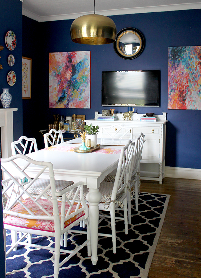
The ones flanking the television in this shot!
I decided to actually have 4 rather large pieces of art in the space. Big art is just a game-changer and when I fell out of love with the gallery wall, the large scale pieces were right there to sweep me off my feet. There will still be some medium-scale pieces as well and when I show you the full design reveal, hopefully it’ll all make sense. So two of those four pieces are obviously the two abstracts.
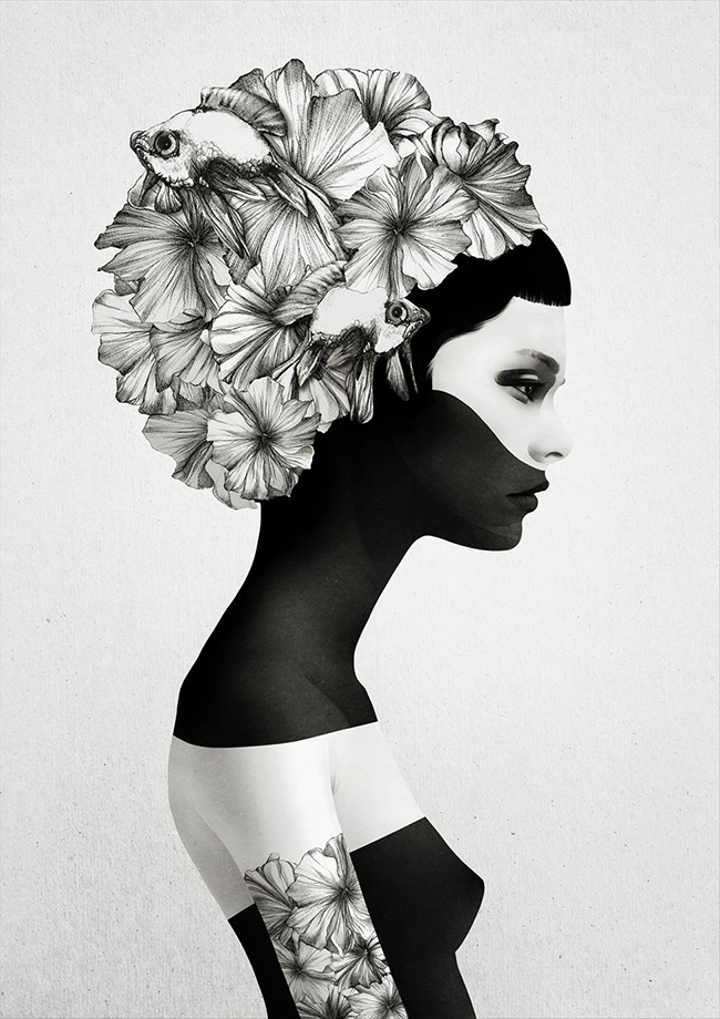
For the third large piece, I’ve chosen Gina Julian’s beautiful print Marie. I blogged about my obsession with this incredible artist here and when I saw it, whatever plans I had for the dining room up to that point got scrapped because I had found my missing piece.
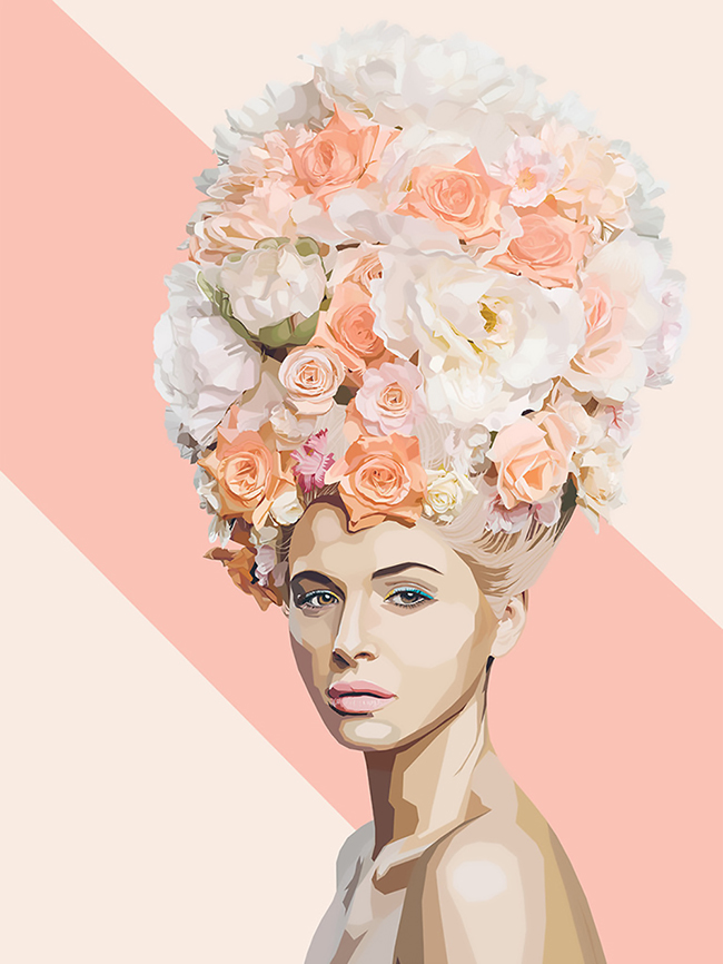
What do I mean by the missing piece? Well, the ridiculous thing is that I preach all the time that when deciding on colours for a room, it’s all about finding that one ‘special something’ that has colour in it – whether it’s a piece of art or a fabulous fabric or a wallpaper and THAT’S where your palette should be taken from (I even said it in the post about Gina’s art!), rather than trying to decide on a colour and then having to find those special pieces to work around it. I think at the time I came up with the berry design, I didn’t have my “magic piece” and so the room just didn’t feel quite right to me. Well, Gina provided that missing piece and a dining room design was born.
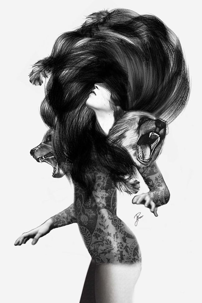
For the fourth large piece in the room, I chose Bear #3 by Jenny Liz Rome *. I just adore the amount of energy and the raw power of it. It’s sexy and strong and fierce… so good. And the strong contrasts of black and white are something I’ll be playing with in the new design so this works perfectly to pull those into the scheme.
*This post contains affiliate links indicated by an asterisks – You don’t pay any more but I’ll earn some pennies to buy a few pretties for the dining room so it’s a win-win! ;)
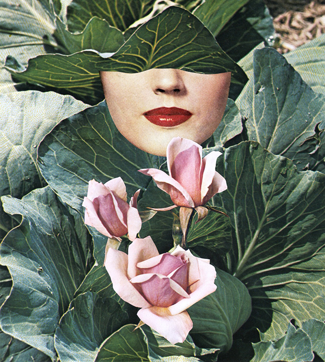
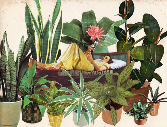
I also chose a few smaller prints for the room – you will notice there is a distinct theme of what I chose here! I fell hard for Seasonal by Beth Hoeckel *. The lush leaves, pale pink flowers and shiny red lips give it a distinctly retro glam look and I just had to have it.
And finally, there is Ruben Ireland and Jenny Liz Rome collaboration called Mariana. * I discovered the piece via Karen from Making Spaces – she showed it in her bedroom (if you haven’t seen her bedroom reveal, you should totally click on over, the art alone is fabulous and she’s just got such cool style) so I totally copied her like a good little stalker and got it too. I honestly couldn’t resist.
 So those are all the pieces I’m currently waiting on totally impatiently even though all of them are coming from the States (COME ON UPS/FEDEX SORT IT). Yes, there is a distinct theme here of fabulously strong, mysterious women in them which will give the room a decidedly feminine/edgy look but happily, Wayne was cool with everything so I was pretty relieved he didn’t have an issue with my choices (he likes strong edgy women, what can I say – ha!)!
Also, I know I showed this image on the blog already but I framed one of my paintings recently and I loved how it looked as most of my stuff is on thick canvases and this was done on just thick stock (side note: I need to sort out prints of my stuff and get a shop going because I’ve had a lot of interest over the years and I’m just an idiot for doing nothing about it) so that will probably end up somewhere as well – probably on the short wall next to the window rather than in the alcove as shown here.
So those are all my choices for the art in this room. However, I did find some other prints that were just amazing and if I’d had room for them, I totally would have loved to have included them in my design so I wanted to share those with you as well.
You know how much I love Nancy Ramirez Cozamia art – I actually have three of her pieces in various areas of my home and she’s got a new one out called Candy Peaks. The colours are just so beautiful and I love the variation in patterns here – this would work so beautifully with some leopard print accessories. (Update: It’s available in the UK here!)
Here’s another by Ruben Ireland called Let Go *. I really debated about this being one of the big pieces in the space but in the end, figured Wayne would think it was too weird and I didn’t want to push my luck so it didn’t make the cut. However, it has a wonderful morose feel to it and yet it somehow draws me in completely.

Another that only just failed at making the cut was a different one by Beth Hoeckel called Terranium *. Oh it’s just so gloriously cool that I want to LIVE INSIDE OF THIS PRINT. While it didn’t work in my design, I could totally see this in a relaxed California Boho kind of space.
I adore the ethereal quality of One Man Workshop’s Dissolve Me * print. Totally different vibe from the others but it instantly calms me.

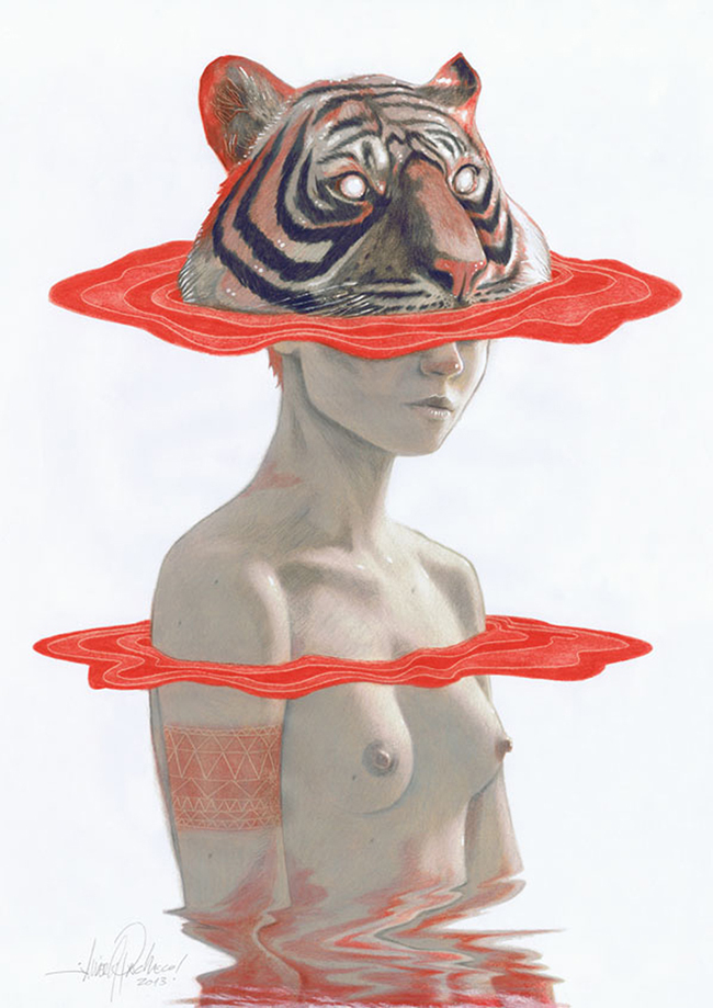
Javier Pacheco’s Tiger Girl * is another very cool contemporary print. If you aren’t opposed to a bit of nudity in your art (and I certainly am not considering the print that hangs in my bathroom), this is a great choice and that reddy-orange is a fabulous starting point for a room soaked in bold colour.
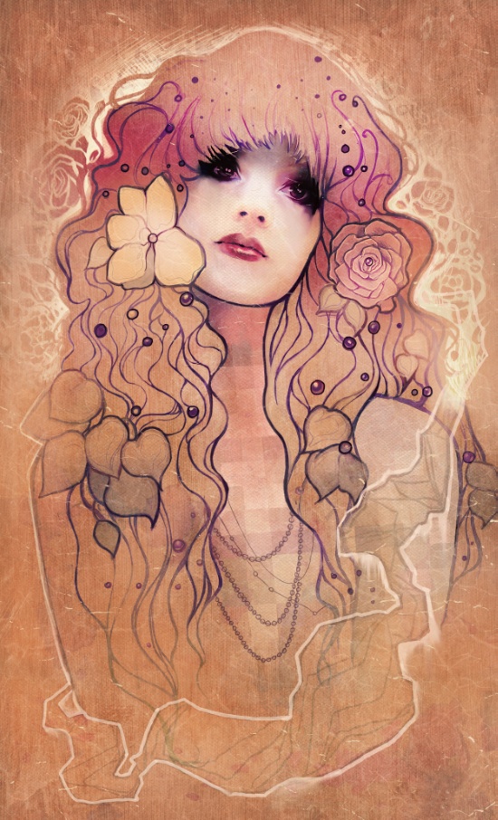
Clearly inspired by Gustav Klimt and the art nouveau movement, I found Megan Lara’s print Laura * to be a beautiful contemporary interpretation of his work. Again, the colours are just stunning and would really add some warmth to a space.
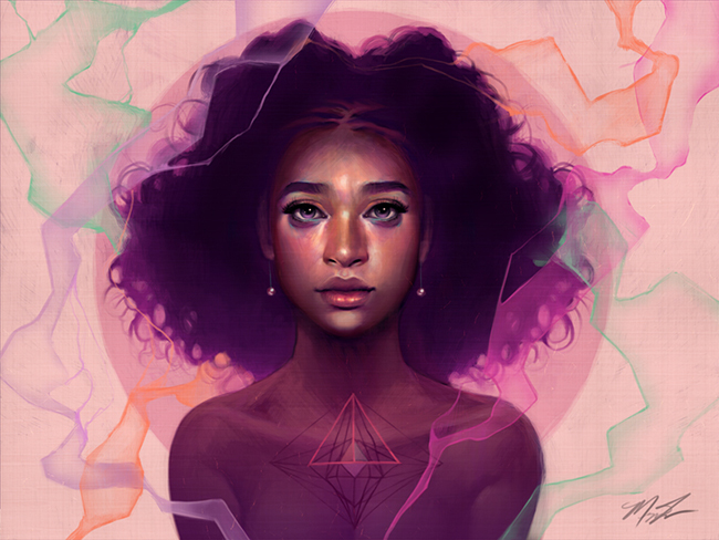
And finally, another by Megan Lara called Facets. I’m not sure what my obsession is right now with females appearing in my artwork but as I said, there is a definite theme going on here!
For me, art needs to grab my attention. I know it can get really pretentious but in order for me to love it, I have to have an emotional reaction to it. I need to feel something in order to connect to it in some way and that’s always the best way to choose what you love. While colours and themes will often play a role in what I end up purchasing, without that emotional connection, there is no point in spending my money on it. So I would always encourage you to buy what you feel you can’t live without and choose the colours/theme as a secondary requirement.
A lot of these prints were found on Society6 which just has such an incredibly varied selection and is quite reasonably priced so if you are in the market for some new prints, it’s a great place to start. I have just started curating some of my favourites which you can see here if you wanted to see a few more that I loved or check out my Pinterest board for inspiration and ideas on how to display art in your home.
What do you think of the choices for the dining room and are there any favourites of the ones I shown? I’d love to hear how you choose art – is it a feeling too? Or do you choose based upon a colour scheme? Or like me, a little bit of both?


Those abstract prints are going to look AMAZING on lighter grey walls! Really looking forward to the reveal!
Aww thank you!! You and me both! Ha! xxx
Fabulous article as I always struggle with where to get art from. I think I’m going to HAVE to have “Let Go” somewhere, that’s right up my street!
Thanks Rebecca!! I know, it’s just such an amazing print, isn’t it?! If you get it, I’ll have to live vicariously through you! ;) xxx
Ooh I love the pieces that you chose! Though I don’t think my husband would give the go ahead on them sadly. I have a Cozamia print in our bedroom that I adore. I’m still figuring out all the decorating in our new house but I tend to buy art that I just like the “feeling” of and then try to figure out how to incorporate it into our spaces. Which is a little backwards ha. Working on being more intentional with what we have.
Thank you! Oh I think you are on the right track really – you should buy with your gut first! If you love it, you’ll find a place for it ;) xx
Beautiful pieces, i chose mine when it slaps me around the face, and then i know that thats the one to buy xxx
Hahaha! I love that and totally agree that’s how it should be! xxx
The art will definitely bring the glamour and the color to your dining space. The pieces are very bold and colorful! And they will look wonderful with the light gray background!
Thanks so much Debbie! xxx
All the art is so good! I love where all of this is going :) xo
Yay! Thanks Kirstin, can’t wait to get this stuff in now! xxx
I’m feeling totally inspired by your choice of prints here Kimberly. I usually start looking at sites and get fed up because there’s nothing I like. I need to try harder obviously. x
Thanks Carole!! Oh I’ve had days like that too! But found so much I liked this time around that I regretted not having more walls ;) xx
Hands down you have the best art on the net. I love all of your selections and I actually think we may have similar art taste. Love this post and I look forward to your dining room reveal! I cannot wait to see how these pieces fit into your space.
Awww Jessica, you are too sweet!! Thank you and so pleased your digging the stuff I’m loving too! xxx
Great choices. Have to say I love the look of your painting too and would be really interested to see more of your own work!
Aww thanks Rachel! You can see a few more of my pieces here: http://www.swoonworthy.co.uk/category/my-paintings/
xxx
LOVE LOVE LOVE LOVE LOVE. I want to order that “Seasonal” print STAT. It’s so perfect! I can’t wait to see where this is going! <333
So good isn’t it? I fell in love with that one instantly – so looking forward to getting going with this project!! xx
What a gorgeous dining space. Absolutely adore Gina Julian’s Print. x
Thank you Geraldine! Her work is so fabulous but the colours in this one just stole my heart ;) Can’t wait to get her up on my wall! xxx
I’m loving that retro collage by Beth Hoeckel, really cool. I love using art to change up a room every now and then xx
I like to use art to change things around too! Probably why I have SO much art that I’m having to store at the moment – ha! I like to swap stuff around way too often ;) xx
Love all the print but I totally want to design an entire room around Marie. Love that print so so much.
I am so in love with that print too and just can not WAIT to get her in my home and up on my wall ;) (that sounded a bit weird but you know what I mean lol) xxx
I love your selections here… Art is very personal indeed and when you see the right one that evokes such emotions you just know it’s the one haha! Love Society6! Great post gorgeous! A x
Oooh you have me intrigued to see the finished thing,lovely choices! This also has me hankering after a dining room. It’s an indulgence to lose a sitting room when we have a large kitchen diner, but one I quite like the idea of, more as a room to all do things round the table as a family, than to dine….
I pick art to resonate with our lives my eye is firmly on an oliver jeffers illustration at the mo
Okay, there’s so much in this post so I don’t even know where to start! Gina’s ‘Marie’ print is ZOMG. So is the Seasonal-cabbigy piece and the slightly creepy swan piece. Actually, that’s not entirely fair because all of these are amazing. There’s something pretty damn intriguing about the Facet’s piece too. GAH! See? This is why there’s barely anything hanging in our apartment; because I’m rubbish at making art choices.
Cannot wait to see what you pick :P xx
Thank you so much again Kimberly for featuring my art in this beautiful roundup! Really appreciate your ongoing support ;)
The Candy Peaks art print is now finally available in the UK over at Hutsly, http://www.hutsly.com/products/candy-peaks-art-print
Big hug!
You’re very welcome Nancy, you know how much I love your work! And thank you for that link, I’ve updated the post for my UK readers :) Big hugs back xx
Oh that’s awesome! Thank you!!