The following is a guest post from Latest Deals.
Want to give your home an upscale vibe without breaking the bank? You’ve come to the right place. Transforming your living space into an elegant haven is all about creativity and resourcefulness. Plus, you can always get more bang for your buck with Must Have Ideas discount codes from Latest Deals.
Declutter with Purpose
If you want your home to look more expensive, start by removing the visual noise. Not buying new stuff. Not rearranging the same chaos. Just less stuff—on purpose.
Begin with the surfaces people actually see: coffee table, kitchen counters, entryway console, bedside tables. Clear them completely. Then only put back what earns its spot. A lamp, a tray, a plant, one candle—fine. Fifteen “useful” bits and bobs? That’s how a room starts looking messy, even if it’s clean.
Next, declutter in the right order:
- Ditch what you don’t use (expired products, random cables, duplicates, impulse buys).
- Group what’s left by category (all chargers together, all cleaning products together, etc.).
- Give every category a home (one drawer, one shelf, one box). No floating items.
Now for the “looks expensive” trick: hide your storage, but make it pretty. Use matching baskets, bins, and lidded boxes to corral the everyday clutter—remotes, toys, paperwork, pet stuff. The goal isn’t to pretend you don’t have real life happening; it’s to make real life look intentional.
A few easy rules that work:
- One drop zone per room. If you don’t decide where things land, they’ll land everywhere.
- Contain, don’t scatter. A single large basket looks calmer than five small piles.
- Leave breathing room. Negative space (empty space) is what makes a home feel high-end.
Decluttering with purpose is basically styling. You’re editing your home like it’s a magazine spread—keeping the good parts, losing the clutter, and making what remains feel curated.
Indulge in Stylish Storage Solutions
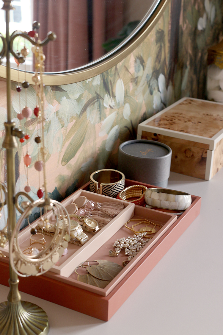
Storage doesn’t have to look like storage. The quickest way to make a home feel more “designed” is to replace random, mismatched clutter with containers that look intentional—like they belong there.
Start with a simple rule: if it’s going to be visible, it needs to be pretty. Think lidded boxes, woven baskets, ceramic canisters, ribbed glass jars, and sleek metal tubs. These pieces hide the mess and add structure to a room, which instantly reads as more expensive.
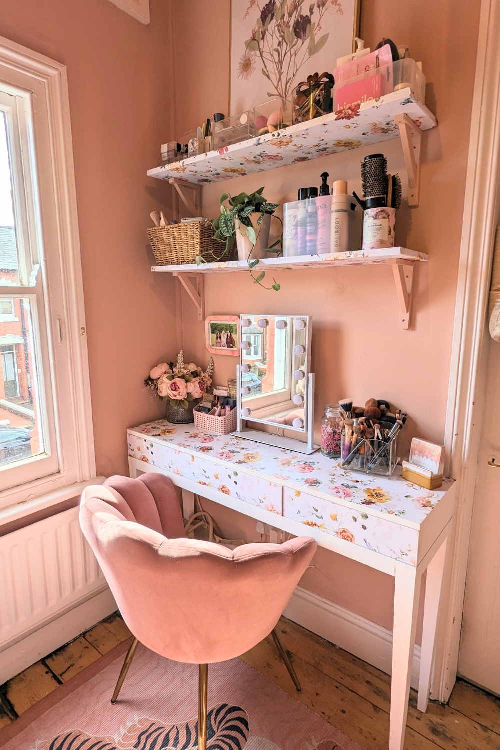
Open shelving is your secret weapon here. A couple of shelves with matching baskets or boxes creates that curated, boutique look—especially in living rooms, bathrooms, and kitchens. Keep the palette tight (all black, all natural weave, all white, etc.) and label discreetly if you need to. It’s calm, cohesive, and low effort.
Mix textures to make it feel layered, not flat:
- Woven baskets for warmth (great for throws, toys, laundry)
- Metal bins for a clean, modern edge (perfect for office bits, cables, tools)
- Colourful containers as controlled “pop” moments (ideal for craft supplies or pantry goods)
One more tiny trick that makes a big difference: go slightly bigger than you think. Oversized baskets and substantial boxes look high-end. Small containers can quickly turn into visual noise.
Bottom line: stylish storage is décor that works. Hide what you don’t want to see, display what you do, and make every shelf look like you meant it.
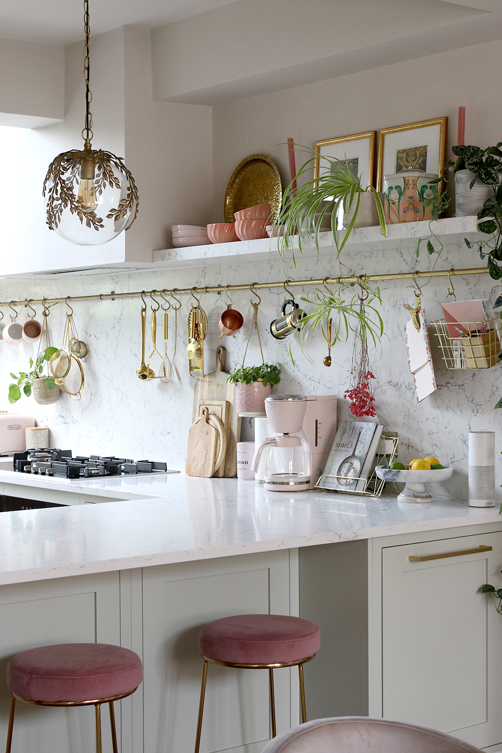
Maximize Vertical Space
When your budget’s tight, square footage is tighter. The quickest way to make a room feel bigger (and look more “done”) is to use the walls like they’re part of your floor plan. As Tom Church, Co-Founder of LatestDeals.co.uk (a discount code platform), puts it: “If you can’t add more space, use what you’ve already got—your walls are prime real estate for storage and style.”
Go tall with shelving units. A slim, vertical bookcase or ladder shelf instantly pulls the eye upward, which makes ceilings feel higher and rooms feel airier. Style tip: keep the bottom half more functional (baskets, bins, files), and let the top half breathe with a few books, a plant, and one statement object. Less visual noise = more expensive vibes.
Add floating shelves for that clean, modern look. Floating shelves read “custom” even when they’re not. Use them in places that normally get ignored—above a desk, over the sofa, in a hallway, or beside a window. Keep the styling simple: stack books horizontally, lean a framed print, add a small vase. If every shelf is packed edge-to-edge, it can start looking like storage instead of design.
Use hooks and pegboards where clutter usually lands. Wall hooks in the entryway stop the chair-pile situation. A pegboard in the kitchen or office turns awkward bits (scissors, keys, tools, cables) into organised display. Matching hardware helps here: pick one finish—black, brass, or chrome—and repeat it so it feels intentional, not random.
Quick rule: if it can be stored up, store it up—then leave your surfaces clear. Clear surfaces are the secret ingredient that makes a home look pricier, even if everything you own came from a bargain aisle.
Upgrade Furniture with Low-Cost Luxuries
You don’t need a full furniture refresh to make a room feel high-end. Most of the “expensive” look comes from small details: hardware, finishes, and fabric. Think of this section as cosmetic upgrades with big payoff.
- Swap out handles or knobs (the fastest glow-up).
Cheap furniture often gives itself away with flimsy, generic hardware. Replacing it is like putting a good watch on a basic outfit—suddenly it looks intentional. Go for finishes that read premium: brushed brass, matte black, polished chrome, or aged bronze.
Quick tip: keep the scale right. A slightly oversized pull on a dresser can look designer, while tiny knobs can feel a bit landlord-special. - Use contact paper or removable wallpaper to fake a luxe finish.
If a tabletop is scratched or just… sad, don’t bin it. Cover it. Woodgrain vinyl, marble-effect adhesive, or textured linen-look papers can give “new furniture” energy for a fraction of the cost.
Make it look real: wrap edges neatly and use a hairdryer on low heat to help it conform to corners. Clean lines = expensive vibes. - Slipcovers: the budget version of reupholstery.
A clean, well-fitted cover instantly makes a tired sofa look pulled together. Stick to neutral tones (cream, taupe, grey, soft olive) for that calm, elevated look, then add texture with cushions or a throw.
Rule of thumb: if it’s slightly loose, you can make it look tailored with tucking and foam cover sticks—yes, they’re a thing, and they work.
Basically: update what people touch and notice first. Hardware, surfaces, and fabric do the heavy lifting—quietly, cheaply, and convincingly.
Create a Color Palette
A space looks “expensive” when it looks intentional. The easiest way to get there on a budget is to stop letting every room freestyle and pick a simple palette you can repeat.
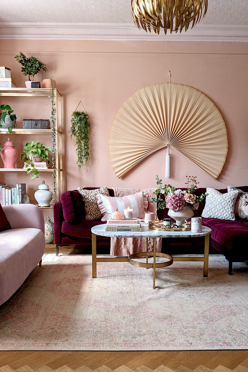
Start with a tight formula: 1 neutral + 1 supporting shade + 1 accent.
- Neutral (60%): warm white, soft beige, greige, pale stone. This is your walls, big rugs, larger furniture basics.
- Supporting shade (30%): muted colour that plays nice—sage, dusty blue, clay, smoke grey. Think curtains, sofa throws, bedding.
- Accent (10%): a punchy tone you use sparingly—black, brass, emerald, terracotta, navy. This is cushions, frames, vases, lampshades.
As Tom Church, Co-Founder of LatestDeals.co.uk (a discount code platform) puts it: “The easiest way to make a home look more premium is consistency—pick a simple palette and repeat it across the room, rather than mixing lots of random colours.”
If your home is small (or just busy), keep the big surfaces light. Light walls and larger textiles bounce daylight around, make corners feel less cramped, and instantly read “airy” rather than “cluttered.” You don’t need pure white either—off-white and warm neutrals hide scuffs better and feel softer.
Then come the “pops,” but make them look curated, not random. A few quick rules:
- Repeat the accent colour 3 times in a room (e.g., a cushion, a print, a candle holder). That repetition is what makes it feel designed.
- Match undertones: warm colours with warm metals/woods (brass, oak), cool colours with cool finishes (chrome, ash, marble-look).
- Use black as a cheat code: a thin black frame, a matte black lamp, or black hardware adds crisp contrast and makes cheap items look sharper.
Not ready to paint? No problem—build your palette with textiles and accessories: cushion covers, a throw, a rug, and a couple of coordinating prints can “set” the colour scheme without touching a wall. And once you’ve chosen your palette, shopping gets faster: if it doesn’t fit the colours, it doesn’t come home.
Light it Right
Lighting is the fastest “this place feels expensive” upgrade—and it doesn’t require a full rewiring moment. You just need layers, warm tones, and a few smart swaps.
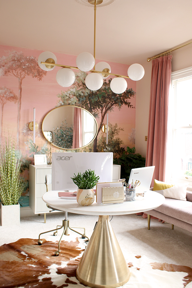
1) Layer your lighting (one big light is a vibe-killer)
If the only light source is the ceiling fixture, the room will look flat. Aim for a simple three-part mix:
- Ambient: overhead or a central lamp for general light
- Task: a desk lamp, reading lamp, under-cabinet strip in the kitchen
- Accent: a small lamp on a sideboard, a picture light, or a soft LED strip behind a mirror/TV
This combo adds depth, shadows, and that cozy “hotel” feel.
2) Go warm + consistent with bulbs
Cheap lighting looks cheap when the colour temperature is icy or mismatched. Stick to 2700K–3000K (warm white) throughout the space so everything feels intentional. Bonus points for choosing the same style of bulb across visible fixtures.
3) Add dimmers—without replacing everything
Hard truth: bright overhead light at 9pm is criminal. If you can install dimmers, great. If not, go easy mode:
- Plug-in dimmers for floor/table lamps
- Smart bulbs you can dim from your phone (also great for scenes like “Dinner” or “Wind down”)
Dimming instantly reads “considered” and upscale.
4) Use lamps to make a room feel finished
A pair of matching table lamps on a console, or one solid floor lamp beside the sofa, makes the whole room look styled. Look for:
- Fabric shades (they diffuse light softly and hide harsh glare)
- Tall floor lamps to draw the eye upward and make ceilings feel higher
5) Make string lights look grown-up
Yes, string lights can be classy—if you treat them like accent lighting, not decoration. Try:
- Warm white micro LEDs along a bookshelf edge
- A subtle strand inside a glass vase or lantern
- Behind a headboard for a soft halo effect
Keep the wire hidden. If you can see the cable doing gymnastics, it’s not chic.
6) Trendy LED shapes = modern, on a budget
Swap basic bulbs for globe, Edison-style, or opal LED bulbs in exposed fixtures. The fixture can stay affordable; the bulb does the visual heavy lifting. You get “designer detail” for a few quid.
Quick rule: If your lighting makes people look good, your home will look good. Warm, layered, dimmable. Done.
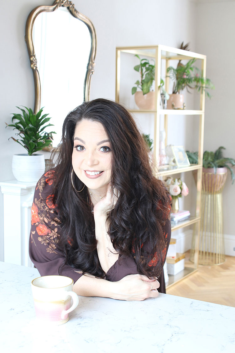
Decorate with Plants
Plants are the easiest “rich-looking” upgrade that isn’t actually rich. They add colour, texture, and that lived-in-but-curated vibe without you having to buy more stuff.
- Start with one statement plant. If you do nothing else, get a tall floor plant to anchor a corner and pull the room together. Think areca palm, monstera, rubber plant, or a fiddle-leaf fig if you’ve got decent light and a bit of patience. One big plant reads intentional; five struggling little ones reads chaos.
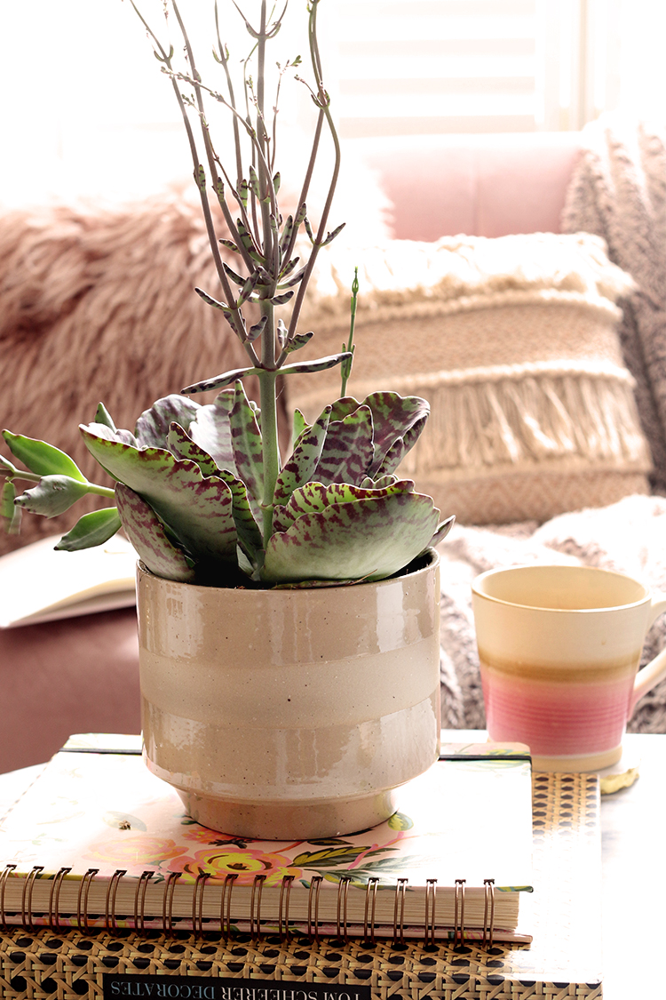
- Use planters like you’d use accessories. The plant is the star, but the pot is the outfit. Go for planters that look considered: matte ceramic, ribbed stone-effect, woven baskets, or simple black/white cylinders. Even a cheap plant looks expensive in a heavier-looking pot. Bonus move: pop the plastic nursery pot inside a nicer cachepot so watering is still easy.
- Play with scale (but keep it tidy). Mix:
- Floor plants (height, drama, fills dead corners)
- Mid-level plants on stools or sideboards (adds layers)
- Small tabletop plants (finishes a shelf or windowsill)
Keep the groupings to odd numbers (3 works wonders), and leave breathing room around them so they look styled, not stored.
- Go faux where it makes sense. If the spot has no natural light (hello, hallway and bathroom), a good-quality faux plant beats a sad real one every time. Spend a little more on one convincing faux, then put it in a great planter and call it a day.
- Make it look intentional with repetition. Repeat one element—matching pots, the same shade of green, or similar leaf shapes—across a room. That tiny bit of consistency makes everything feel more “designed” and less random.
- Keep them looking expensive: clean + contained. Wipe dust off leaves, trim dead bits, and avoid stained saucers. A neat plant reads luxury. A crusty one reads “I tried.”
Personal Touches That Stand Out
This is where “nice” turns into “yours.” The trick is to add personality without adding clutter—think curated, not crammed.
- Build a gallery wall that looks intentional (not random).
Stick to a simple rule: keep either the frames consistent or the art style consistent. Budget-friendly frames can still look high-end if you:
- choose matching tones (all black, all oak, all white),
- use the same mount colour (white/cream instantly looks cleaner),
- and hang them with even spacing (about 5–7 cm between frames).
For the art: printable downloads, charity shop finds, pages from old coffee-table books, or even your own photos in black-and-white—cheap, but sharp.
- DIY, but make it look grown-up.
Skip anything that screams “craft day” and go for projects with clean lines and solid finishes:
- paint thrifted vases in one matte colour,
- make oversized “statement” art using tester pots and a canvas,
- upgrade plain cushions with iron-on trim or simple stitched borders.
The secret weapon here is repetition: one DIY item looks quirky, three look like a design choice.
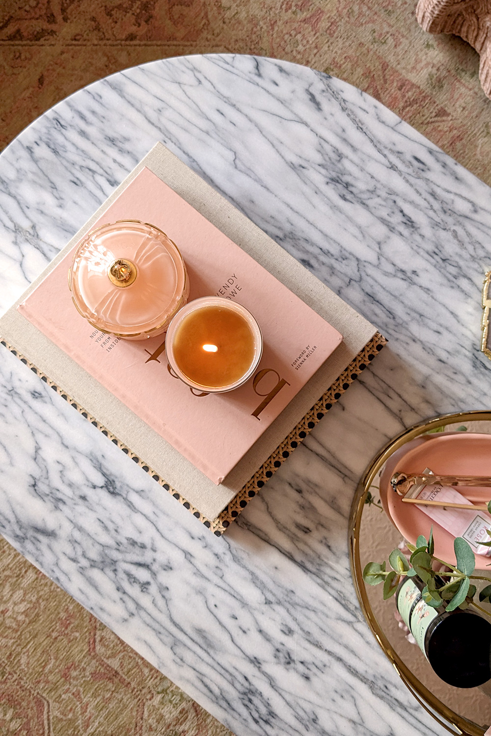
- Use decorative trays like you know what you’re doing.
Trays are basically the cheat code for looking organised. They turn everyday mess into a “setup.” Try:
- a tray on the coffee table with three items max (candle + small plant + book),
- a tray on the kitchen counter for oils/salt/pepper so they look curated,
- a bathroom tray for perfume, hand cream, and a small dish for jewellery.
Keep finishes aligned—wood, marble-look, black metal—so it reads expensive even if it wasn’t.
“When you’re updating a room on a budget, small, repeatable touches—like matching frames or coordinated accessories—have the biggest impact for the least effort.” — Tom Church, Co-Founder of MustHaveIdeas.co.uk, a discount code platform
Bottom line: personal touches should feel edited. If it doesn’t earn its spot, it goes. That’s the difference between “decorated” and “designed.”
Final Tips
A space looks expensive when it looks intentional. Not crammed, not “just in case,” not “I’ll deal with it later.” The good news: you don’t need a big budget—just a few habits that keep everything feeling calm and curated.
- Go minimalist where it counts. Leave a little breathing room on shelves, sideboards, and countertops. One statement vase on a table often looks pricier than five random bits fighting for attention. If it doesn’t earn its spot, it goes.
- Do a quick seasonal swap. You don’t need new décor—just rotate what you already own. Move cushions between rooms, swap prints, switch throw blankets, change a tray setup. It tricks the eye into thinking you’ve refreshed the whole place.
- Hunt smart, not hard. Big “expensive” wins usually come from timing: end-of-season sales, outlet sections, and online promos. Before you buy anything full price, check deals and use discount codes (like Must Have Ideas discount codes from latestdeals.co.uk) to stretch your budget without compromising on style. As Tom Church, Co-Founder of LatestDeals.co.uk, puts it: “A few minutes hunting for a valid discount code can make a real difference—especially on home buys where the savings add up fast.”
Keep it simple, keep it tidy, and buy with a plan. That’s the whole flex.