I feel like I’m constantly looking AT and looking FOR wallpaper. Which is kind of strange because I’ve only used it a total of 3 times in my home – in my kitchen, in my living room and in the dressing room.
However, I’ve been on the hunt for a while now for the perfect paper for various other areas in my home: the panels in my living room, the hallway (for when we eventually get around to doing that) and one other place…
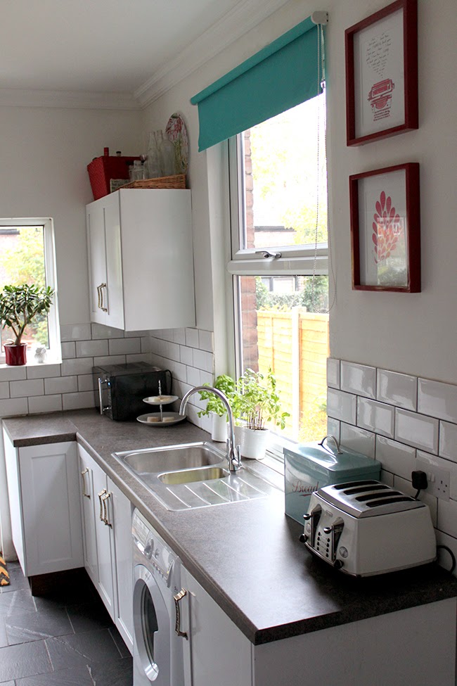
Ya see, I’ve been thinking for a while about changing out the wallpaper behind my kitchen shelving.
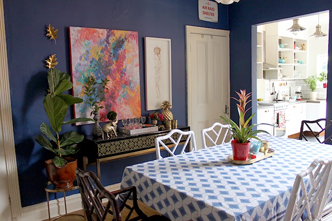
When I’d first put it up, it matched the adjoining dining room perfectly – in fact, I’d originally planned on using this wallpaper in the dining room before I decided on a gallery wall and I’d found a paint colour that was an almost identical match which is how I chose that dark grey paint colour you see in the image below.
Here’s how nicely everything USED to tie together…
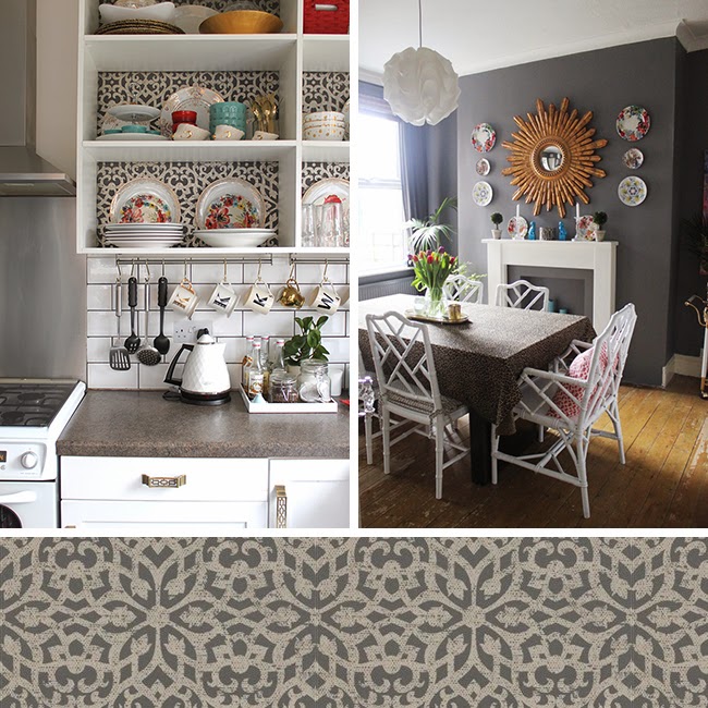
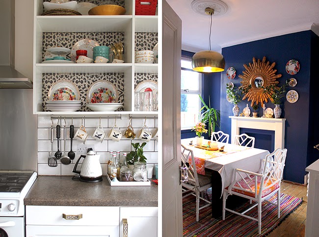
However, as you know, in the last year, I repainted my dining room in a dark blue. So now that wallpaper – as lovely as it is – no longer really ties with the dining room.
So for a while, I’ve been keeping my beady eyes out for a replacement. Let’s ignore how HORRIBLE a job it was to wallpaper the kitchen shelving – I think wallpaper is a bit like childbirth – as soon as it’s up, you forget the pain and anguish and only can look starry-eyed at your beautiful little miracle…erm…. room.
So I wanted something a bit more colourful in my kitchen. I like the turquoise/red/white combo but you know me – I’m a girl who likes to combine colour in interesting ways. And if I could bring a print into the kitchen which allowed me to have a little more fun with my colour palette, then that’s what I was going to do.
And this, my dear ones, is what I have my eye on.

GASP!! It’s just gorgeous, isn’t it?? It’s Designer’s Guild Alexandria wallpaper in the magenta colourway.
Here’s another view…
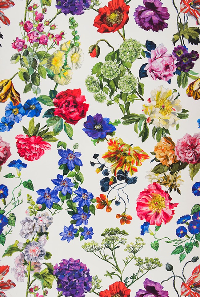
Oh god yes. GET IN MY HOUSE.
So hopefully my dining room will tie in much nicer with that new wallpaper backing the shelves…
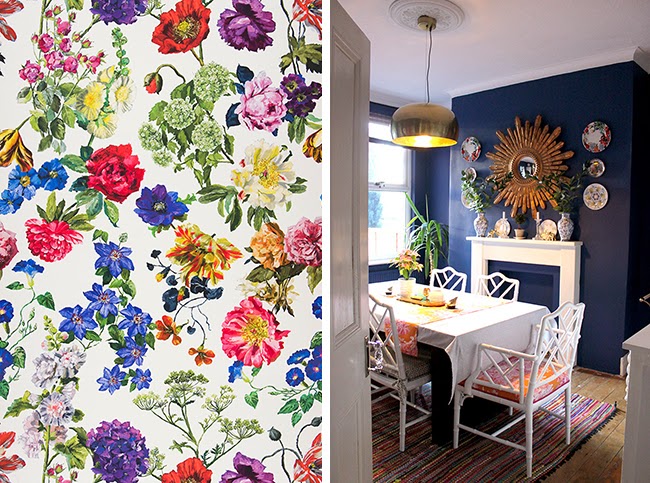
So much better, no?
I was trying to find a picture so you can see how the kitchen and dining room tie together but this is the only one I could find. Apologies it’s crappy and from last year (it’s not an angle that works well because the bright kitchen always gets blown out) but at least you can kind of see what I mean about the rooms being in close proximity…
It may mean my turquoise-y accessories may either have to some how be adapted to the new colour scheme or be replaced. I haven’t thought that far in advance yet. I know the roller blind which is currently a cheapy dark turquoise one that we just got so our neighbours weren’t staring into our kitchen cost less than £20 and I’d always intended on replacing it at some point.
So as I said earlier this week, it’s the decorating domino effect – one thing changes, other things have to be updated along with it. I’m going to see if the blues have enough variance for it to work but I’m open to making changes if it doesn’t, ya know?

The wallpaper is £68 per roll – while not cheap, I don’t actually need a lot of it so that’s a big plus. And it’s so stunning that I think less than £100 for something that I really desperately love isn’t a bad compromise.
When this is actually going to happen is anyone’s guess because we are feverishly trying to get the bathroom done at the moment but a bit of wallpaper is not a huge undertaking (a few good hours’ work) so I’m hoping in between waiting for the adhesive to dry on the cornicing, I could get busy doing this little side project!
What do you think of my choice? Is this a wallpaper you would use? Spot any gorgeous wallpaper lately? Do tell…


I think that wallpaper will look stunning as the backing to your shelves. I can't wait to see it!
Yay! Thanks Lynne! xx
It is gorgeous!! I say yes!
Whoop! Thank you!! xx
I stumbled across your blog a few weeks ago and I love it. I happen to be colour crazy too, so the more colour the better! Have you thought about painting your turquoise blind in a pattern to tie in with wallpaper? And why not add different colour accessories to your already turquoise colour scheme, so you don't have to throw them out, just add more pops of colour! Good luck with the
Oooh I hadn't thought of painting the blind! Interesting idea and even if I screw it up, it's only a roller blind I would have gotten rid of, right? Thanks for that :) As for the turquoise stuff – yep, I'm going to live with them for a bit and see if I can make it work with some of the other colours before doing anything drastic (I'd probably give them away before chucking
Hydrangeas AND it's called Alexandria*? UM YES PLEASE. The shot of the wallpaper next to your dining room is too legit to quit. If I was as ballsy as you with colour, I would so go for it. But for now, vicarious design FTW. <br /><br />*Well, my full name is just Alexandra, but close enough. Derp.
Haha! I'm definitely taking it as a sign that I must get this wallpaper! ;) xx
It's so beautiful! You could frame some of it elsewhere in the house if there's any left after the shelves, and then you've got some free art out of it too! xxx
that is ridiculously beautiful wallpaper! I can't wait to see what it looks like in your kitchen, it's always easier the second time you do something…right? (-;
That is so very pretty! It will look amazing. My faves are Timorous Beasties Thistle (in pink and red!), House of Hackney's Hackney Empire in Midnight, and the gorgeous oversized floral in Emily's bathroom (Cupcakes and Cashmere blog). I've got some Timorous Beasties in my dressing room and I have the House of Hackney fabric (waiting for the right project to come along) and am
Oh I love it! You have to get it, it will be perfection! Also it opens up a new world of possible colours for the blind in the kitchen seeing as anything will match it! It's like a very happy rainbow!
That wallpaper is stunning – I think it would look wonderful.
oooo girl, that is so fabulous! wish I had the guts to use something like that! it's going to look great.-JT in TX
Woah, that's some pretty right there!! As you know, I'm a huge fan of Farrow and Ball's Lotus. It makes my heart sing every time we walk into that room. <br /><br />And I'm eyeing up some terribly sexy Matthew Williamson loveliness for our utility room right now, dontcha know?!<br /><br />Meanwhile, I can't believe you haven't pondered how to get another chice of
Mmm… I love your current kitchen decor, but I can also totally envision how fabulously that amazing wallpaper is going to tie in to your dining room! I love it!
nice share