Ever since Pantone named Turquoise the 2010 Colour of the Year, I have been seeing quite a lot of it’s cousins – deep teal and peacock blue – cropping up in blogland. Like a more grown-up version of turquoise, it adds depth and class to a room.
(Side note, I’m seriously lusting after that amazing chandelier…)
 |
| via Houzz |
Although I would say that ‘peacock blue’ has a bit more blue in it and ‘deep teal’ has more green in it, they seem to be used quite interchangebly in many of the posts I’d seen. Whatever you want to call it, it looks great paired with white which just pops when the two are paired.
Need more convincing? Well, read on…
This feature wall really brings the dining room to life. And I seriously heart the shape of that mirror.
 |
| via Young House Love |
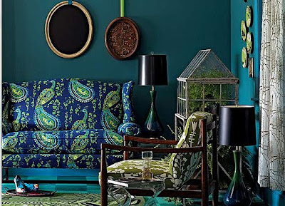
I like the electic style of this room although I’m not entirely convinced by the pattern on the sofa. Still, the deep rich tones in the wood and the black lamps strike a nice balance.
 |
| via |
The accents of gold and orange also look pretty fabulous against this colour too. Those built ins are to die for as well in this eloquently appointed living room.
 |
| via |
The dark gallery wall looks amazing with a veritable cocophany of interesting bits and pieces.
 |
| via Lonny |
And I featured this lovely dark teal dining room when I talked about some gorgeous rooms in Trad Home.
 |
| via Trad Home |
So now that you can see why I am loving this gorgeous rich colour which works in pretty much every room in the home, I decided to go with it in one of mine.
Here’s my paint choice…
 |
| Dulux Hawaiian Blue 2 |
More details to come… Intrigued? Mmhmm, I thought so. I’m all about the tease me.
Saying that, those who are friends with me on Facebook or following me on Twitter will already know which room I painted so if you want to be in the know, then come and join the party by clicking the links either here or on my sidebar.


You know I need no convincing about this colour at all! SO excited to see pictures of that room you've painted :-)
Hi gorgeous, <br /><br />I just saw that you won a giveaway at Romi and Bob's blog. I don't know if she'll contact you directly as it asked you to send your email to her..so I thought I'd come over and let you know just in case! Well done, missus!! <br /><br />Sarahxx
intrigued, yes! teal was the accent color at our wedding. there are no traces of it in my home today but after seeing these images, i can see the allure. but i still love tuquoise!<br /><br />hugs.<br /><br />michele
I'm always afraid of dark walls but this looks nice. i think your paint choice is a good one for doing a dark blue wall. love the photo from lonny. enjoying your posts :)
I am not convinced since I have already been convinced! Those dark walls are so perfect. If there is a word that describes more than perfect, I would have chosen it to express my adoration of the color. The feature wall with that exquisite mirror is quite enlightening. An additional blue item placed in the room would mess it up. The wall is more than enough to imply the room’s overall aesthetic.