So I am, along with everyone else on the planet, a little obsessed with Instagram. Buried amongst the thousands (millions?) of pictures of coffee with perfect froth on wooden tables and long tanned legs on beds and all the flatlays of beauty products you won’t possibly use in a lifetime are a wealth of amazing accounts sharing interiors and home inspiration. Again, like everyone else, I find myself mindlessly flipping through my feed at points of boredom or distraction during the day but there seem to be a few accounts that always catch me pausing, really taking in what I’m looking at. Eyes widen, an intake of breath, a quickening of the pulse. This is how I get when I find an account with a feed that just speaks to me.
I wanted to share just a smattering of some of my favourites with you today. Not just to look at their pretty feeds and encourage you to follow them (which, yes, of course, I’m doing that) but to see what design lessons you can actually pick up from these talented Instagrammers.
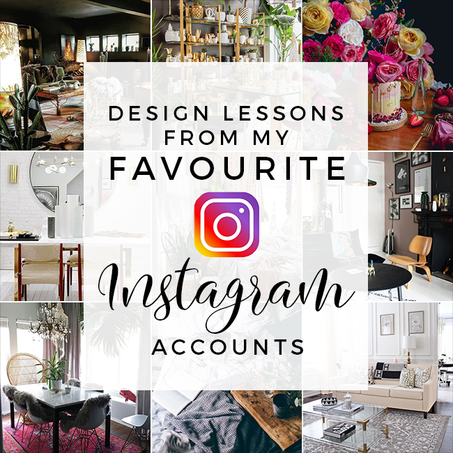
Lesson One: If you’re going to go dark, ya gotta have texture.
I love Cowboy Kate’s feed. Dark spaces, luxe finishes and boho elements combine to create an amazing look that I just kind of want to crawl into forever. Her home is incredible plus she just recently did a wall treatment that included half black, half white (maybe cream?) with gold leaf to create a sort of glam ‘peeling plaster’ effect that looks divine. The one thing she always does, however, is pull you into the dark with so many textural elements from her sheepskin rugs (which she sells) to wicker to velvet to woven textiles, there’s just always something that adds both visual interest and wow factor.
Lesson Two: There is no such thing as too much gold.
Black Rooster is a retail store in Canada and if I could hop on a plane tomorrow and live INSIDE OF THE SHOP, I totally would. They have a way of setting up their store that makes me just want all the gold and black and marble I could possibly stuff into a huge crate and ship it back across the pond. I know a lot of people are scared to go overboard with all the gold but when you strip back to a monochrome palette without a lot of other things fighting for attention, it can totally work.
Lesson Three: Chaos can be beautiful.
Ahhh, Kara Evans. I have a massive girl crush on her and we’ve previously discussed running away together to create a fabulous boho glam home. Okay, so that’s probably not gonna happen but her crazy boho look just gives me heart-eyed emojis all over the place. Didn’t make your bed today? Who cares? Pile on the plants and macrame and I promise no one will even notice. I love a bit of what I like to call ‘artfully arranged clutter’ and Kara is the perfect example of this.
Lesson Four: Yes, you can mix boho and glam together.
Nicole Naranjo’s feed encapsulates what I love about Boho Glam style. It’s elegant and yet there’s just something about it that makes you want to stay awhile and just chill out in all those gorgeous surroundings. She also has a pink front door. PINK PEOPLE. I love it so much. There’s also a cute dog in the mix. There’s little wonder I love her feed so much.
Lesson Five: Flowers and bold colour mixes will make you smile every time.
My inclusion of Julián Ángel may seem a little out of left field. After all, he’s a baker, not an interior designer or blogger. However, his feed is just so full of colour and life and FLOWERS AND CAKE and it’s just pure unadulterated joy. I love his short videos of making his creations and despite a lot of his feed being in Spanish, pictures speak 1000 words right? The language of love may transcend all but the language of design comes pretty damn close too.
Lesson Six: Soft neutrals don’t have to be boring.
If you ever needed an example of how to do soft pale neutrals with panache and elegance, look no further than Michelle at AM Dolce Vita’s feed. It’s beautiful with a soft mix of pattern and colour where greys, pinks, gold and white frolick serenely together to create a beautiful synergy. I love the sheer elegance of her style and those wall panels had me at hello.
Lesson Seven: There’s inspiration to be had in aspirational design.
Consort Design’s feed is packed to the brim of gorgeous inspiration and while I’m pretty sure I can’t afford even a quarter of what they share, I still can take inspiration from it. So for instance, despite the fact that light fixture probably costs a bajillion dollars, I love the idea of playing with scale and above your dining room table is such a great place to flex your design muscles. I also love how they’ve beautifully mixed something that’s very contemporary (that marble and brass table) with chairs that clearly have their design roots firmly in the 50’s. I also love how they’ve taken some Scandi elements like the white painted floorboards and brickwork and combined everything thoughtfully to create a beautiful space. When you are looking at designs that are out of your budget, sometimes it’s good to really break down the elements – why does it work? Can it be replicated on a smaller budget? Nine times out of ten it really can.
Lesson Eight: You can be inspired by a style that isn’t your own.
I said in my recent post about defining your style using Pinterest that I can love any style if it’s executed well. And Theo-Bert Pot’s Scandinavian influenced pad is exactly what I mean. It’s not me, it’s not my style and yet, I find his execution so stunning with his intense mix of colours – from slate grey to pale pink and deep blue along with smatterings of iconic furniture and accessories both old and new. I love his home and I love how committed he is to creating a beautiful bold ever-changing space that keeps me coming back for more.
Lesson Nine: Cute animals make everything in life a little bit better.
I absolutely had to throw this last one in here because, well, I’m a crazy cat lady and Ezgi Polat’s gorgeous photography of her two absolutely beautiful kitties give me heart palpitations. If you are a cat lover, trust me, you’re going to LOVE her feed.
So that’s just a smattering of some of my favourite Instagram feeds and the lessons I can pick up from every single one of them. Any favourites of the ones I’ve shown? Do you have any favourite accounts on Instagram that I should be following? I’d love to know! Hit me up in the comments!


CRACKING post lovely! Totally agree that there’s a lot to be learned. It’s taken me years to figure out what’s working and what isn’t in our house and Instagram is invaluable for figuring out which elements are the missing piece of the puzzle.
From Karen – who also wants to live inside the Black Rooster store. Why can’t they open in Manchester? :'(
*Immediately head’s to instagram and follows them all*
I’m a boho girl myself and I’ve only followed one. Now I have several that I need to go follow ASAP.
xoxo,
Carla
http://www.carlabethany.com
Great post, not just the interesting links but your commentary too. Thank you ♡
A few more for me to follow here. Thanks hun x
THANKS SO MUCH FOR INCLUDING US AMONG THESE SWOON-WORTHY ACCOUNTS! LOVE FROM TORONTO, CANADA!
XO NINA @BLACKROOSTERDECOR
Couldn’t agree more, I find Instagram hugely inspiring! A few of these I already follow and will be checking out the others asap!
some very beautiful pictures, all worth a second look xxx
Really interesting post. It’s nice to have a mix of what you’re following, get a different perspective on life :)