Happy Friday! If you are currently viewing Swoon Worthy on a laptop, you may have noticed that things look a little bit different around here. It was niggling at me that the main photo I was using for the blog didn’t feel quite right any more. It was an overhead shot of my coffee table when there was a lot of turquoise in my home and since then, I have basically eradicated most of the turquoise not just from the living room but from the rest of my home too.
(If you looking at this on a mobile, then I’d encourage you to go have a look at the desktop or tablet site but I did some screen shots so you’ll get an idea for now!)
Here’s a screen shot from what the home page looked like just after I shared the full redesign in January. (Excuse the fact that there’s a rolling header in the middle – it’s just the way the screen shot captured it because my screen isn’t large enough to capture the entire homepage at once!)
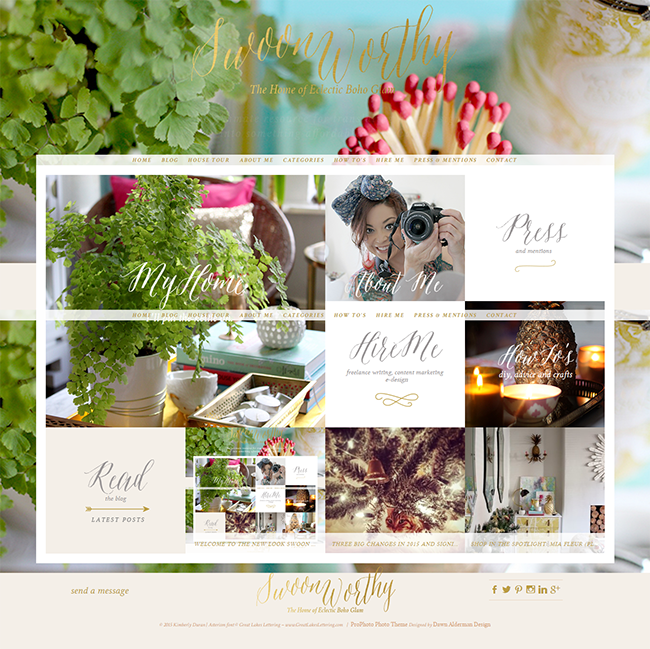
So having a main image which contained quite a bit of this colour felt – yes I’m going to say it – off brand… Sorry I’ve been in marketing for about 12 years and so I’m conscious of this sort of stuff! What do I mean by that in more simplistic terms? As nice as it was, it just felt like it wasn’t really ME any more.
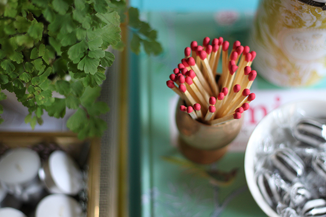
Here’s the full background image:
Here’s a shot of what it looked like in August 2015 – you can see I’d made a few changes to the images used in the Home Tour, the About Me section and the How To section but that background image remained the same.
Adding to that, I was conscious of the fact that it was difficult to read my logo against the background. It didn’t really pop out and the calligraphy font, while pretty, can be a bit hard to decipher. Being able to comfortably use my website is as important to me as someone being comfortable in my home. I want people to be able to relax and enjoy themselves when they are guests in my house and being a guest here on my little virtual home is no different. So, I wanted to address that difficulty.
Anyway, I finally got around to doing something about it – not least because I was introduced to this really cool free tool called Peek by my lovely fellow Manchester blogger Old Fashioned Susie and if you’re a blogger or you have your own site, you might be interested in this too. Essentially, they record a person’s first impressions of your site and it’s usability and send it to you. It’s 5 minutes of totally unbiased opinion from a stranger – which could be pretty valuable. I took it with a grain of salt, of course, because one person’s opinion isn’t necessarily going to be everyone’s opinion but hearing my ‘tester’ offering critique about things that I already knew were issues was enough to spring me into action.
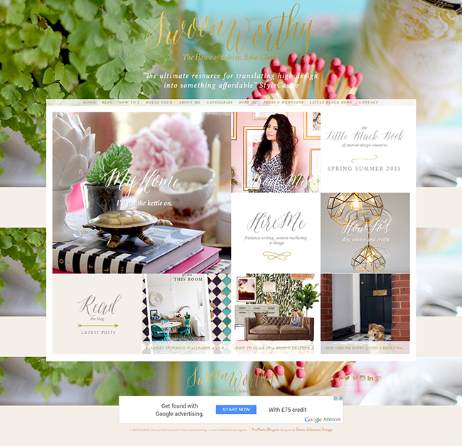
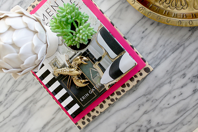
This is the replacement image I chose – another overhead shot of my coffee table!
And here’s the new look! (Again, excuse the rolling header – I really need to do a screenshot using a larger screen!)
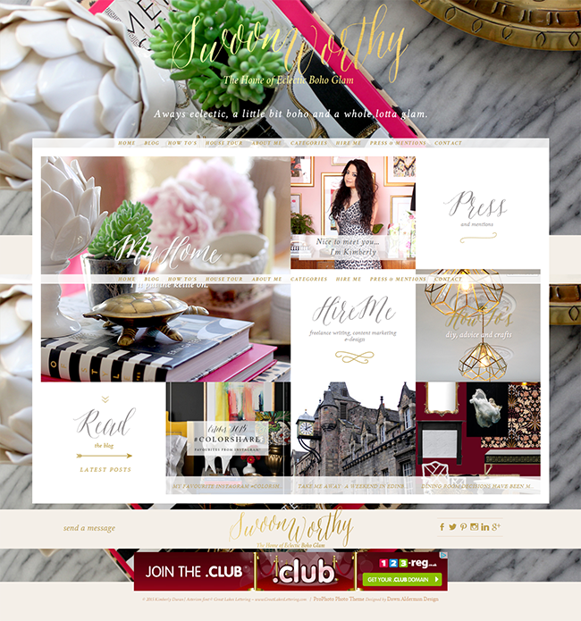
I love the new colours – the black, white, pink, gold and leopard print feel so much more like me and I brightened up the logo as well to make it a bit easier to read. I also changed where the ‘About Me’ text because you couldn’t read it at all previously and changed some of my buttons in my sidebar and my social media pages to reflect the new look. It didn’t take me too long to give the blog a bit of a refresh and I know it’s not a huge change or anything, but suddenly, I feel so much more at home here. I think sometimes it’s good to reassess what’s not working well for you when you are a blogger, to keep improving and to keep updating things that feel a bit ‘off’, don’t you?
I hope you like the new look!
![]()
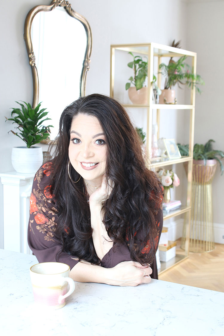
I also wanted to mention that I’m over on my friend Julia from Cuckoo4Design’s blog as part of her fabulous series, Living Pretty with Your Pets. Yep, an entire post dedicated to my fur babies!! Go check that out and whilst you are there, make sure you have a look around Julia’s gorgeous home (as seen below). I just love her style, she’s one of my favourites.

![]()
So what do you think of the little mini rebrand? Do you think it’s more ‘me’ too? Is Peek a tool you’d consider using for your own site? You know how much I love hearing from you ;)


You are so good at branding yourself :) and thanks so much for the sweet shout out. Have a wonderful weekend!
Thanks so much darling! Well, I try!! Ha! You too xx
I like the new rebrand very much, Kimberley. It looks more polished and as usual beautiful. Thanks for the changes.
xoxo
Aww thank you, I think it works better too! :) Have a lovely weekend! xx
Love the re-brand. The background colors are droolworthy!
Aww thank you! And can I just say I love the design of your own site – it’s beautiful! xx
Love it, and so pleased you left the leopard print pic in ! Gorgeous xx
Yay! Haha! Yeah, I wasn’t going to take EVERYTHING she said so seriously so the leopard print dress stays! ;) xx
Thanks for the mention, very happy to have helped! Have a lovely weekend xx
You too darling! Have a fab weekend! xx
I like it – I didn’t dislike the first one, but now you’ve changed it I see how it’s better :) Very brave to give Peek a go, I’ve still not done it! x
I liked the original image too but it just felt less like me the longer I had it! Thanks so much! And go on, do it! It’s great to get some unbiased feedback and you’ve got a lovely site so you shouldn’t have any fear ;) xx
Hm, a little less colourful, right? Love it!!! Haha, I would say that, wouldn’t I? Seriously though, it looks fab and just a little more grown up whilst still being very you. I’d say it’s a definite success ;-) xo
Hahaha! Yes you would say that!! Thanks darling! ;) xx
Like it a lot, less girly and more grown up glam. I think the leopard, black and gold is more what you’re about, with pops of other colour in between…the marble table does no harm either! Have a good weekend. Sharon
Yep I think so too! Thanks so much, happy you agree it’s a good change :D Have a lovely weekend, hun xxx
Totally agree, that image is so much more you!!! Not that the previous picture was bad, but this one shows your signature colour and style, condensed in a sharp and snappy image. Well played, Duran.
Yay! Thanks hun, I liked the original image but yep, just didn’t feel right any more ;) xxx
Hi Kimberly,
Love the new ‘Mini Rebrand’ as it improves your site so much.
The photo of Julie’s room looks gorgeous but I wonder does she have children?
We could never keep a room that pristine with uor 3 little monsters!! Ha ha.
Marcel
Hi Kim, love the new look of your blog. Sophisticated and Glam with a touch of animal print. AWESOME!
It looks great lady! Really polished and luxurious. :)