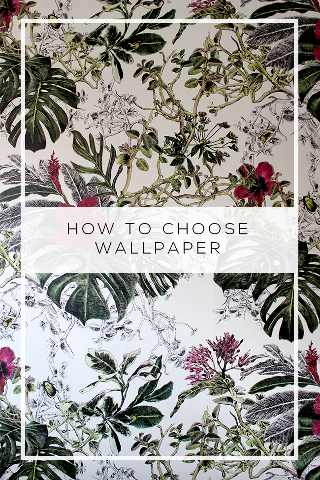
One of my lovely readers, Melinda, recently emailed me asking for a bit of help with choosing a wallpaper. She had her inspiration image at the ready but was wondering if there were any wallpapers that I thought might work with the bold colour scheme of jades and pinks. Immediately, a wallpaper came to mind (and it was genuinely immediate because I had just spoken of the wallpaper on the blog as it was a new favourite).
So then I thought – this might actually make a good post! I’m of the opinion that there are probably very few rooms out there that couldn’t be made just that little bit better with a shot of wallpaper. I love pattern and I love colour and for me, as a total and complete maximalist, in my opinion a little more is always better. I realise this is probably not the norm – I’m totally okay with that.
Now, the best way to choose wallpaper is to first find a wallpaper that you love and then work your room around the paper and let it be your guide to deciding your colour scheme and the textures and furniture that you’ll be bringing in. However, this is in a perfect world where you have a blank slate and how many of us start with a completely blank slate? Only a lucky few really, relatively speaking.
So what if the room is already nearly complete but you are looking for the final flourish?
I figured today I’d show you 6 different styled rooms (okay, 7 if you count my own living room) – all lovely and gorgeous in their own way but ones which I actually think could be made just a little sexier, a little more swoonworthy, with the addition of a bit of wallpaper! And I’m going to tell you not only what I would choose for each of them but also why. Of course, there are probably 100 different wallpapers that would work with any one of these but I figured it’d be a fun exercise! Let’s get started…
TIP #1 – MARRY YOUR WALLPAPER TO THE MOOD YOUR ROOM EVOKES
Let’s start with Melinda’s original inspiration room and the wallpaper I recommended… I mean, House of Hackney’s Castanea in White picks up all the wonderful colours in there clearly.
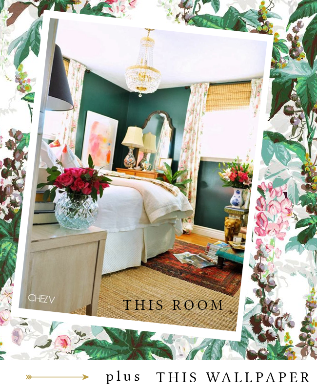
From the deep jade of the walls to the pinks and touches of yellows, colour is obviously a big reason I chose this wallpaper. But there’s something else: The room is quite feminine (let me just state for the record: I really hate assigning genders to decor because it’s ridiculous but we really need to find better language to describe what we mean that’s universally understood… so until then, I use “feminine” and “masculine” when speaking in terms of design, grudgingly!). Because of that feminine look, I think it’s great to really embrace that and go for a bold floral paper to work along with it. I think you really need to consider the mood and style of a room and ensure it marries well with the style of the paper – if we had the exact same colour scheme in a very heavy, masculine space, this paper wouldn’t necessarily work. Make sure your paper evokes the same mood as your room.
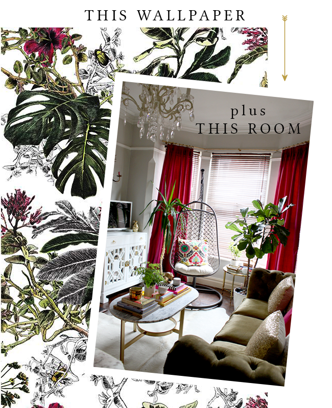
When I chose the wallpaper in my living room, it was a similar scenario – the colour scheme of olive and raspberry was picked up so well in the paper but more importantly, it was the tropical feel of plants and blooms that highlighted all the greenery that lives in this room!
TIP #2 – MOTHER NATURE NEVER CREATES A BAD PALETTE
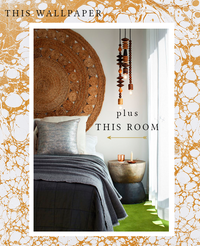
The next inspiration image has just the most insane textures – the velvet headboard and the shimmer of the gold lamp are both stunning and I love that bit of animal print cushion peeking out. I really think something very natural but a little bit glam would work well here which is why I chose Schumacher’s Ashland in the Pheasant colourway here (and you’ll see I use a different paper in the same Nest range later because it’s just SO GOOD).
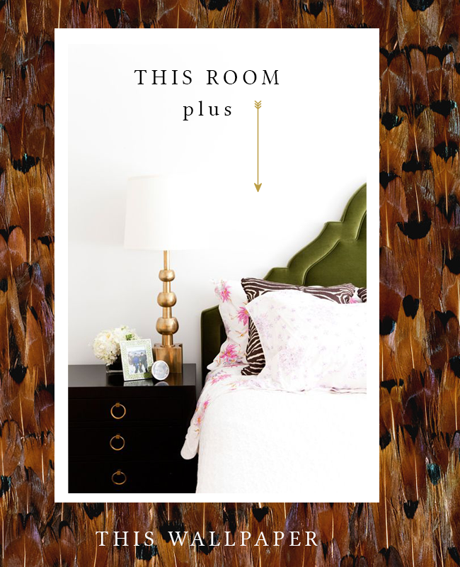
Of course, the deep golds, brown and blacks would look stunning against the black glossy bedside table with the gold pulls and the more natural palette of olive green and dark browns works as beautifully against that feature backdrop as it would in nature. If in doubt, Mother Nature never creates a bad colour palette so be inspired by what you see outdoors.
TIP #3 – CONSIDER RECURRING THEMES OR COLLECTIONS
Our next space has a much more regal look about it. It’s stately and mature and looks as though it’s been collected over many years and many miles of travel, doesn’t it? So in this case, I think this black toile mural from Rebel Walls would work beautifully in here.
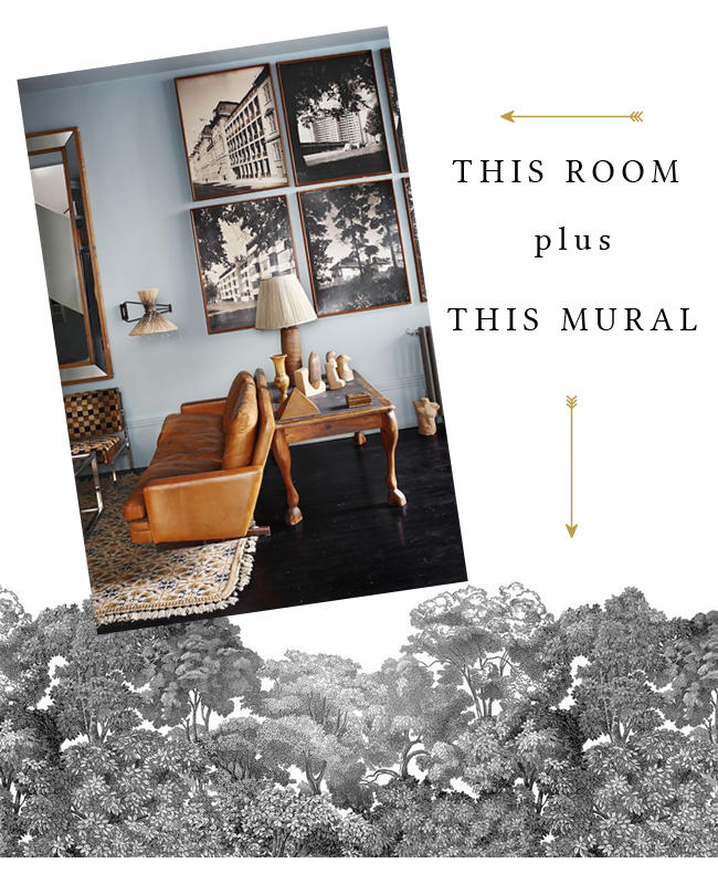
The framed pictures were really the inspiration in choosing this mural with the tree silhouettes a reoccurring theme on that gallery wall. If you have a collection in your room, then choosing a wallpaper (or a mural in this case) that unifies that theme and really brings it to the forefront of your design is one way to make that decision a little easier. Because the colour palette in the room is predominantly muted with lots of natural textures and colours, then going for a more muted colour palette in your wall covering means nothing will jar unnecessarily.
TIP #4 – CONSIDER RECURRING SHAPES
Speaking of natural textures, this next room is just fabulously boho! I mean, the rug-as-wall-hanging is pure genius, isn’t it? I love the glint of metallics alongside more bohemian textures – the soft shimmer of the cushion on the bed as well as the glimmer of the bedside table are both reasons why I chose this fabulous Wabi Bone gold marbled wallpaper from Calico.
Again, there’s something very organic about the marble effect but because it has a metallic finish, it picks up and turns it from simply boho to a bit more boho glam. The shapes in the marbling also mirror the round shapes in the wall hanging as well as the light fixture. Repeating patterns are another way to choose your wallpaper. Are there certain shapes that are picked up again and again in your room? Why not emphasise this with the patterns within your wallpaper?
TIP #5 – MAKE YOUR WALLPAPER A SENSORY EXPERIENCE
Our next inspirational room is gorgeously glam – I mean, who doesn’t love the combination of a soft silvery grey velvet sofa with a cowhide rug and a sexy black and white print? But guess what? Yes, I reckon this room would look even more stylish, even more sexy with this amazing feather wallpaper.
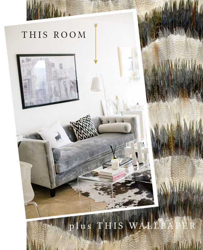
Yes, I’m using another Schumacher Nest wallpaper here – Belle Isle in Birch – because it would really work so beautifully from the silvery blues to the creamy whites. Again, nature always wins!! There’s so much depth to this paper, it really makes you want to just touch it, doesn’t it? And all rooms need texture – if you only appeal to a few of your senses, a room will never feel complete. The sense of touch is so important and using texture creates a room that goes from sterile and stiff to one you want to kick off your feet and relax, no matter how ‘beautiful’ the space is or how much you wouldn’t want to mess it up. And that makes a space INVITING. That’s what creates rooms we want to actually live in rather than just ones we like to look at on Pinterest!
TIP #6 – ADD MOVEMENT TO A STERILE SPACE
Right, last one! I choose a more Scandi room scheme here because it’s not my normal style but there is a beautiful simplicity in it. So yes, I’m gonna take that simplicity and glam it up because well, that’s what I like to do.
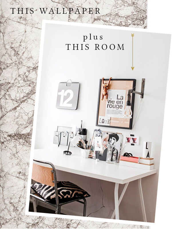
I feel like this room is good but it could just be edged into great… wouldn’t this marble wallpaper from Ferm Living just add a finishing WOW to the space? Yes, yes it would. It’s just that little bit too sterile for my tastes but because the marble has so much movement in it, it would really create some drama without going OTT and ruining that simplicity. You add something that looks natural and organic into a space and suddenly it goes from a little bit frigid to total sex appeal. Also? That little office needs some plants – am I right?
So I hope this little exercise has made you think about wallpaper in a whole new way. Look at the bones of your room and what you already have going on – not just the colours but the style, the textures, the shapes, the mood it evokes and ask yourself if wallpaper can fill in any missing blanks – and then search within that framework to choose your paper.
Now, which one of these rooms would you like to live in? And do you think the addition of wallpaper would make them better or am I barking up the wrong tree?
Inspiration image sources: Chez V / Swoon Worthy / Lilly Bunn via Desire to Inspire / Lorenzo Castillo / Eco Chic / Apartment Therapy / Hus & Hem via Decor Dots
![]()


ohhh….what beautiful wallpapers. I am looking at bird wallpaper or huge thistle print wallpaper at the moment for the landing at the top of my staircase as a back-drop for my mirror collection, but may look at some of the feather wallpaper now. Love wallpaper on one wall or behind shelving to gather colours together in a room.Inspired!! xx
The feather wallpaper is TO.DIE.FOR. And me too! Can’t get enough of a great wallpaper ;) xx
This has been sooooo helpful Kim. Ive been sourcing wallpaper for MONTHS for my little entry nook and its been a beast of a job to do. I want something bold and fun for the little space that will also compliment the deep teal walls of the rest of the living and dining rooms. Im literally at a stand still bc i havent found a thing thats caught my heartstrings yet. Maybe you can give me some ideas? Love all the pairings you made here.
I shall have a look and come back to you!! This post was such fun to put together ;) xx
Great post! Especially loving your last pick, the marble wallpaper! Can you please share the source info on that one? Thanx!
Hi Karen – oh! I hadn’t realised I’d not included it so thank you! It’s from Ferm Living (I’ve updated the post too): http://www.fermliving.com/webshop/shop/marble-wallpaper.aspx
Hope that helps!
xx
Kimberly, this post was SO awesome! I absolutely love the way you found the perfect paper for those gorgeous rooms! And I want more – you should keep doing these :)
Aww thank you darling! I actually really enjoyed putting this post together, perhaps I’ll do more of these! xxx
I love the first option…if it was only for me!!! I know it’s quite tricky the feminine/masculine thing. So many people pigeon hole designs but the key is balancing the space for both! Also I love the marble wallpaper from Calico. I’m a big fan. Even though Martin Lawrence Bullard does have quite unusual ones too. great post!!x
Ahh that’s it though! Most of us have to take another person’s opinions into consideration ;) xxx
The hackney wallpaper is Devine. I’m in love.
It’s rather amazing, isn’t it! Sigh! xxx
These pairings are perfection. Love every single one! You’re right, the spaces on their own are great but those papers just take them to the top. Wish I could paper. Maybe the guest bathroom! Can’t wait for more posts like this!!
Your blog is quite inspiring – I originally came here to find a source for your wallpaper in the living room (the one with herbs on it), but did not succeed yet.. Could you please help?
Sure, the previous paper was from Cole & Sons and it’s called Cow Parsley in yellow :)
http://www.cole-and-son.com/en/collection-new-contemporary/wallpaper-66/7050/
Hope that helps! xxx